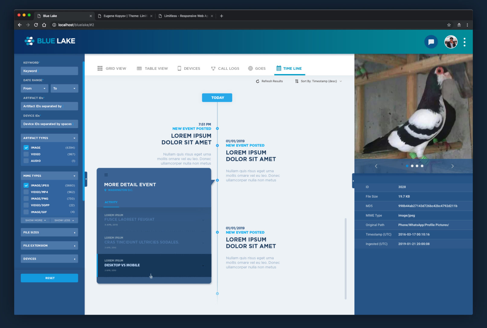
Blue Lake 2.0 Web Application
Blue Lake 2.0 Web Application - Ongoing Project
How I started: Audit Older Version
![]()
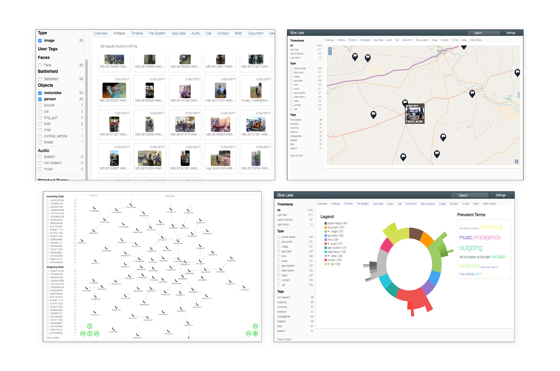
The key process of the auditing the previous version was finding visual issues, user’s errors and measuring how to define the problems.
– Inconsistent visual assets: layouts, icons, font, colors, spacing, line weights and overall tones.
– Team researcher found that the majority of users having issue with navigating thru the app.
– Also we found a lacking of interaction in between the artifacts and widgets by user testing.
Define / Reframe
![]()
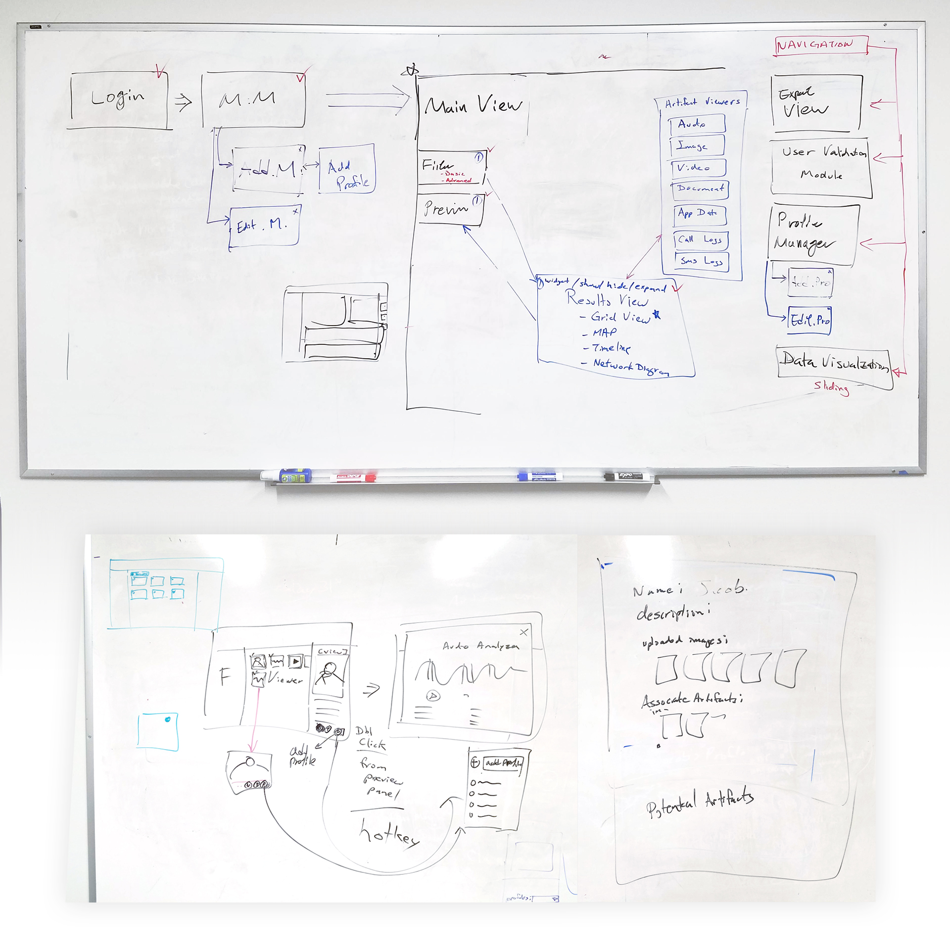
The problem I’m trying to solve, focusing on the user’s viewpoint.
– Recreated a site map
Ideate / Prototype
![]()
Generate a large amount of ideas to solve the problem.
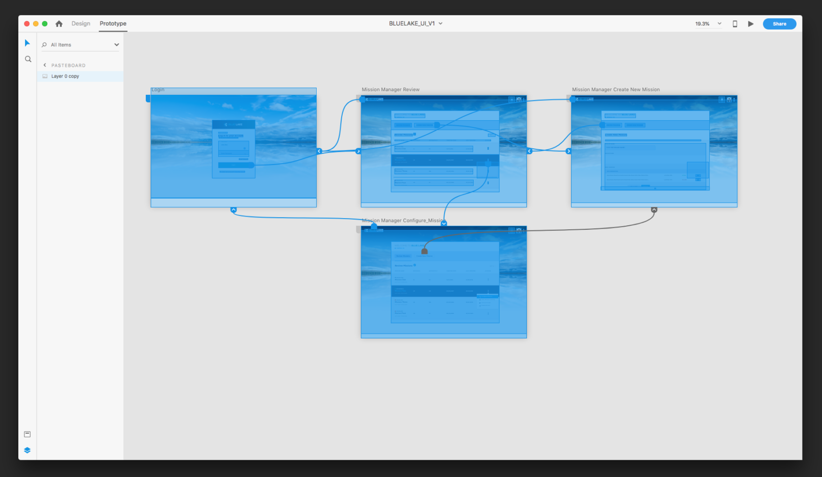
– Focus on the user flow and simplicity.
Validate the ideas.
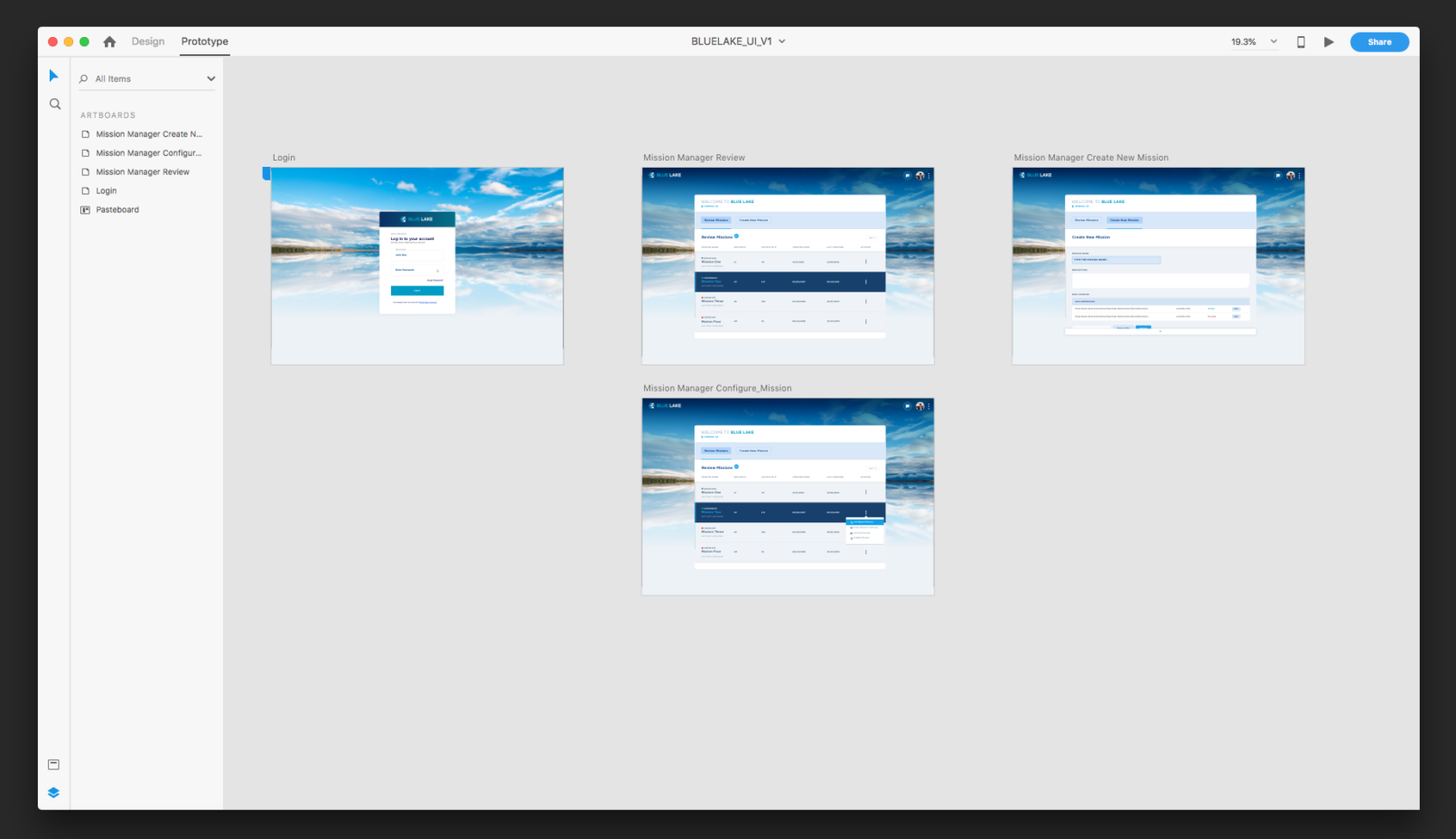
– The simplest is to make a prototype of it.
Define, Iterate & Design
![]()
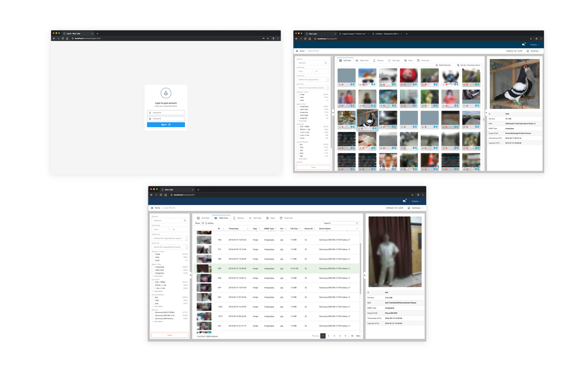
Require redefining and iterations based one the few test.
– Revisited user’s requirements and missing artifacts in the site map.
Follow the brand guidelines and design system
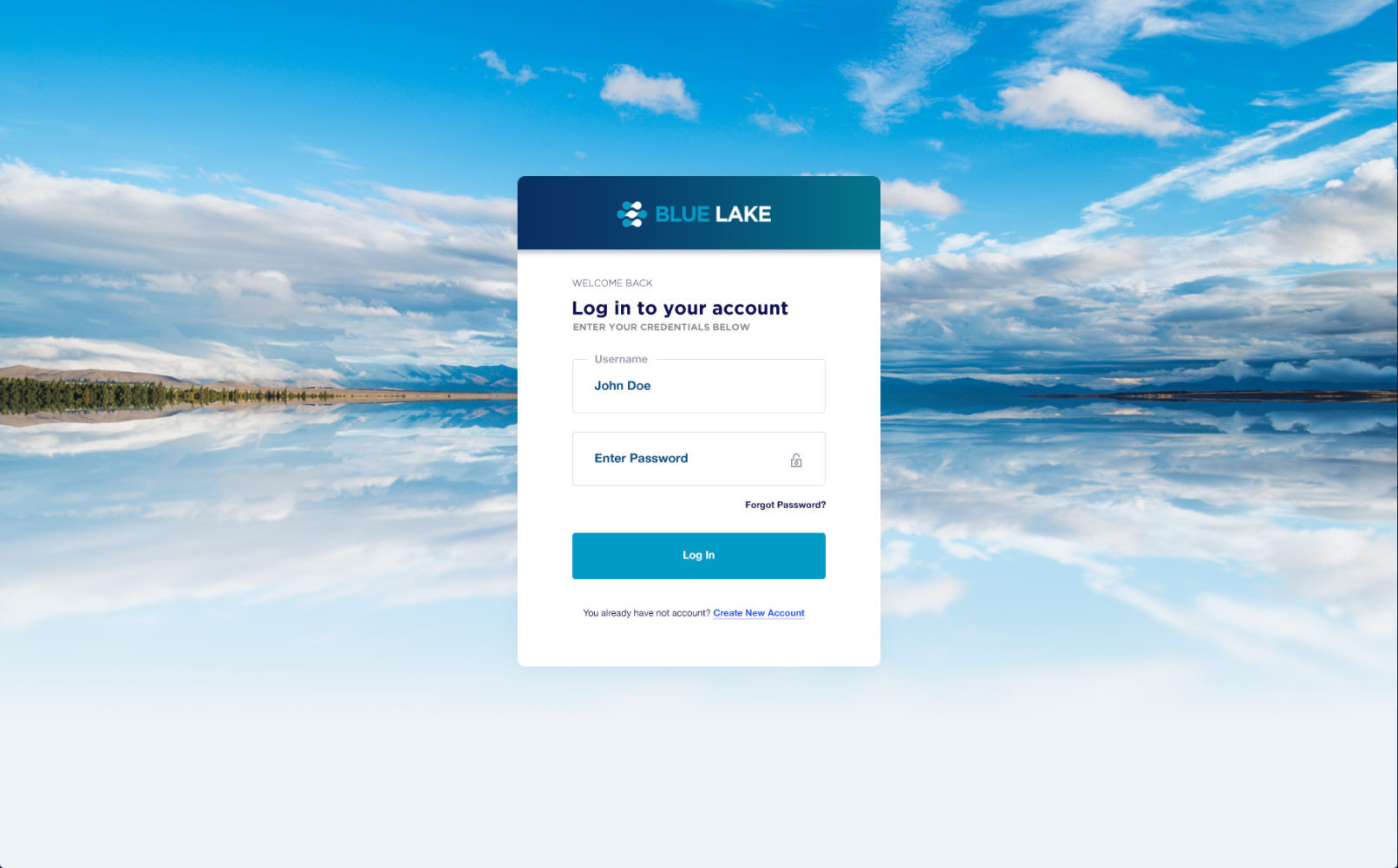
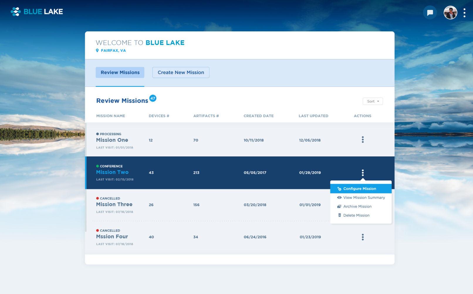
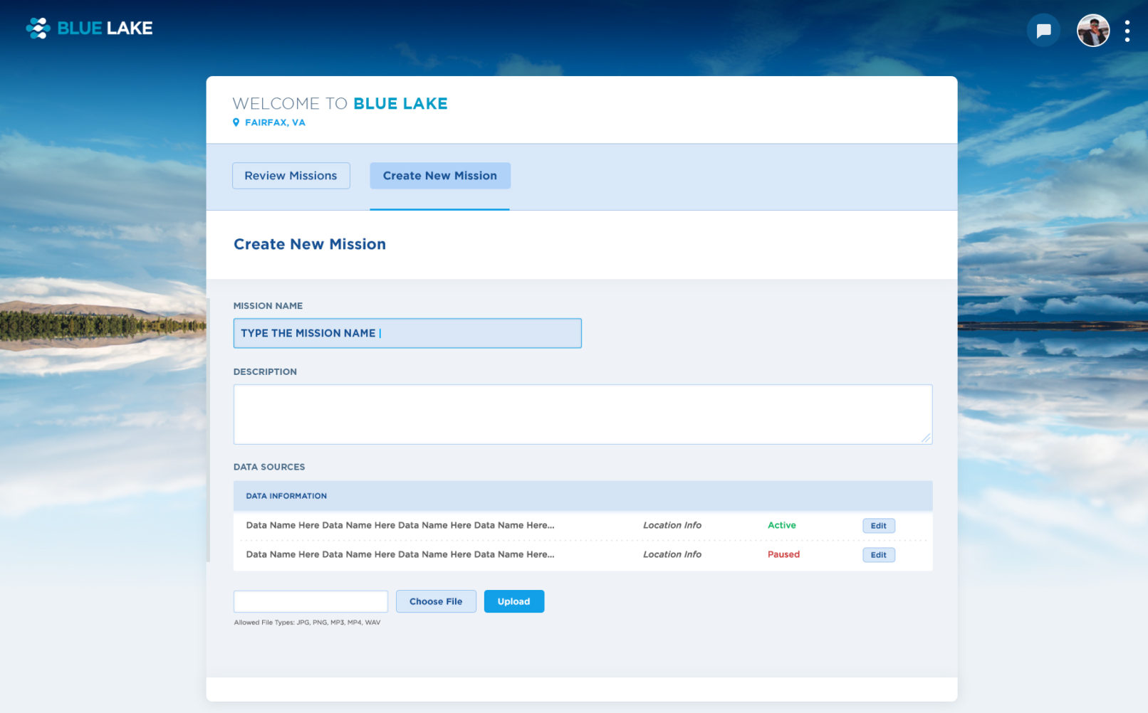
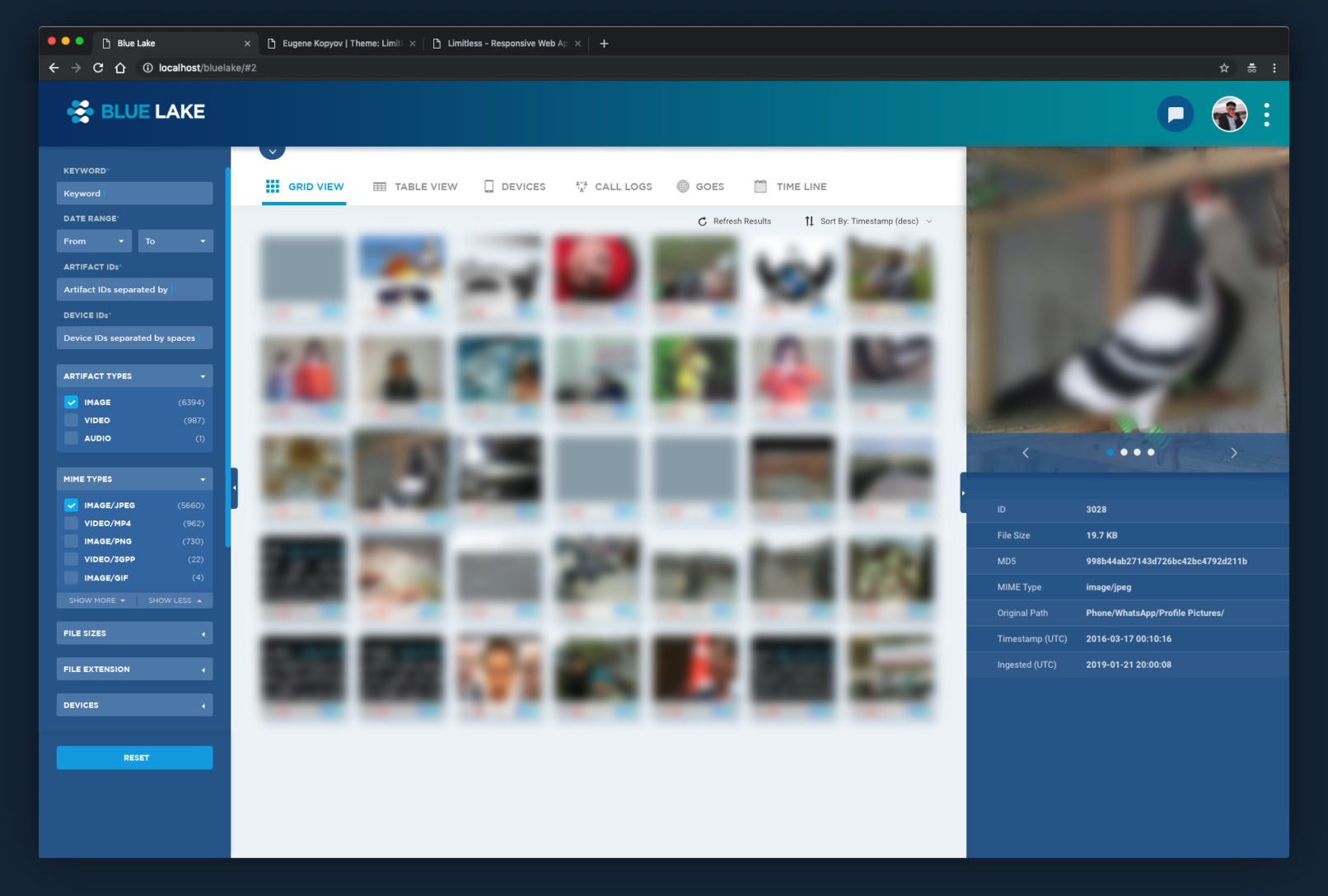
– Redesigned branding: logo, color schemes and tones.
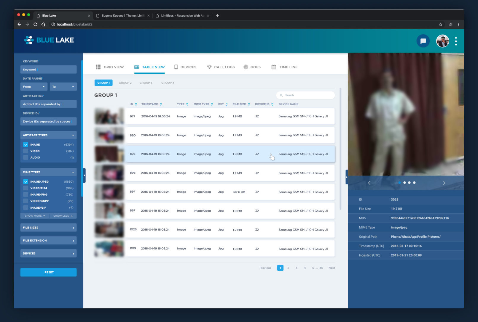
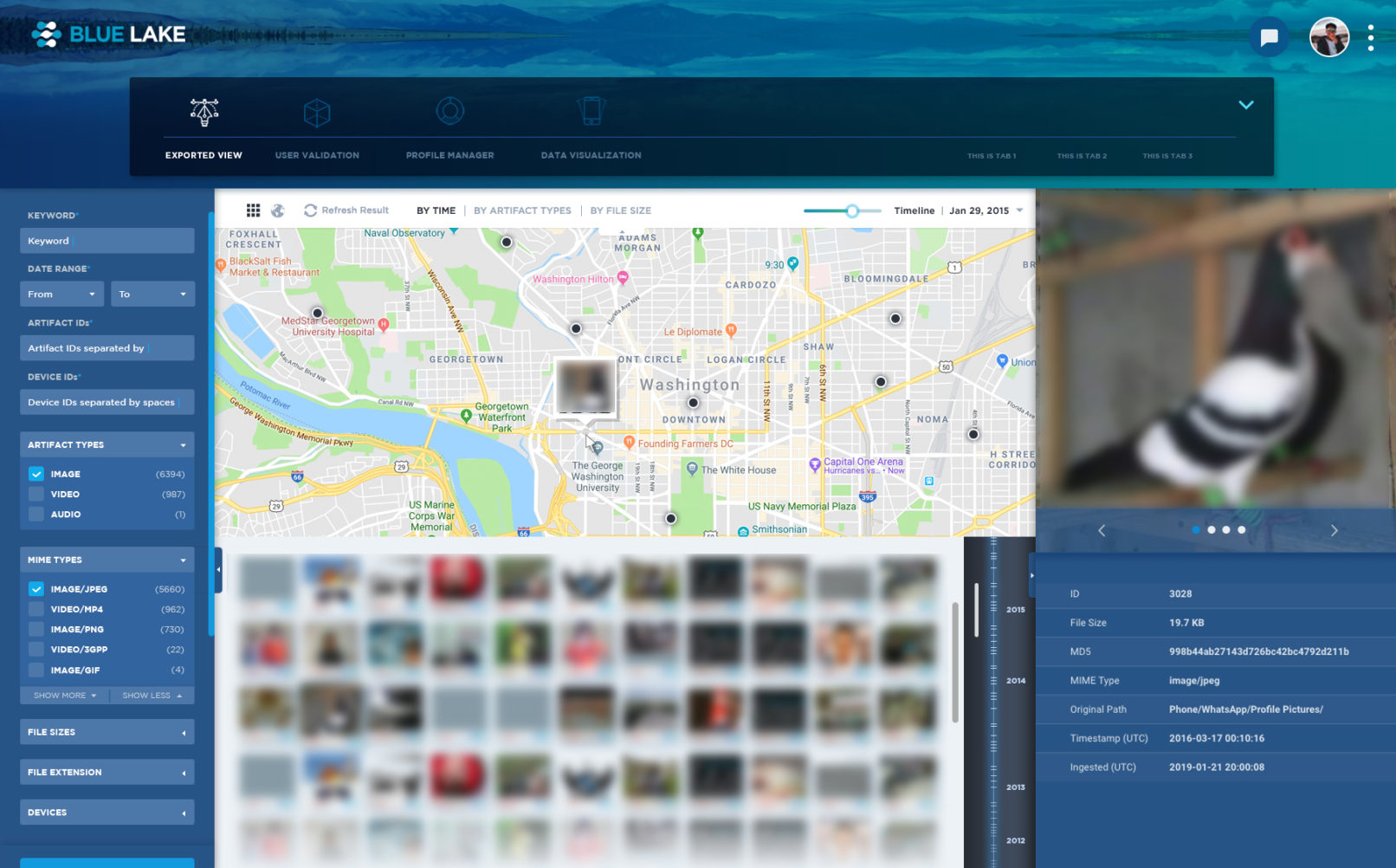
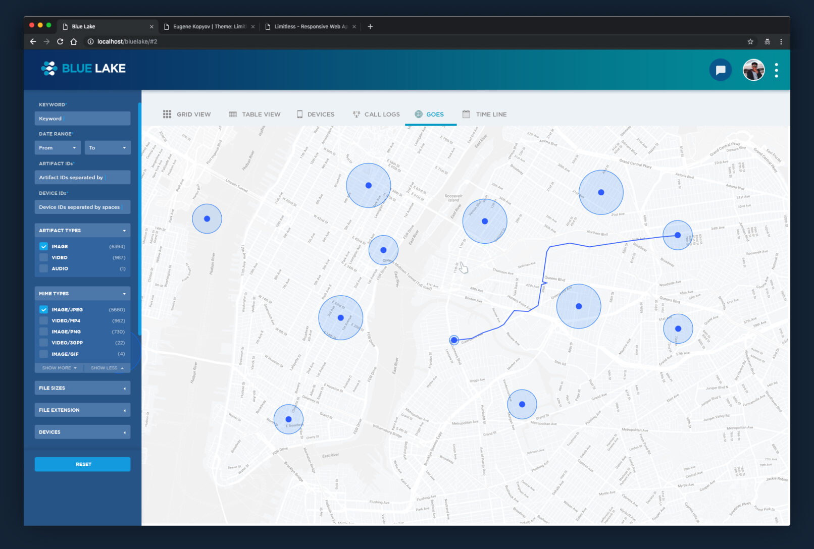
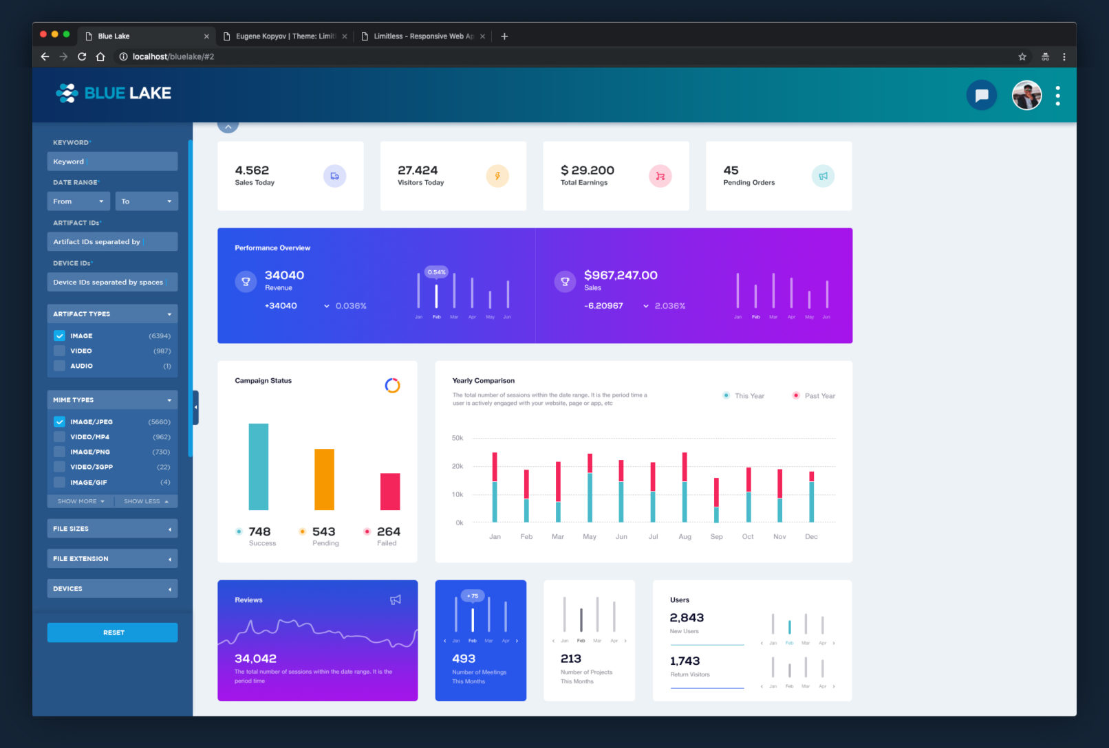
– Aligned with the consistent layouts, icons, font, colors, spacing, line weights and overall tones.
